
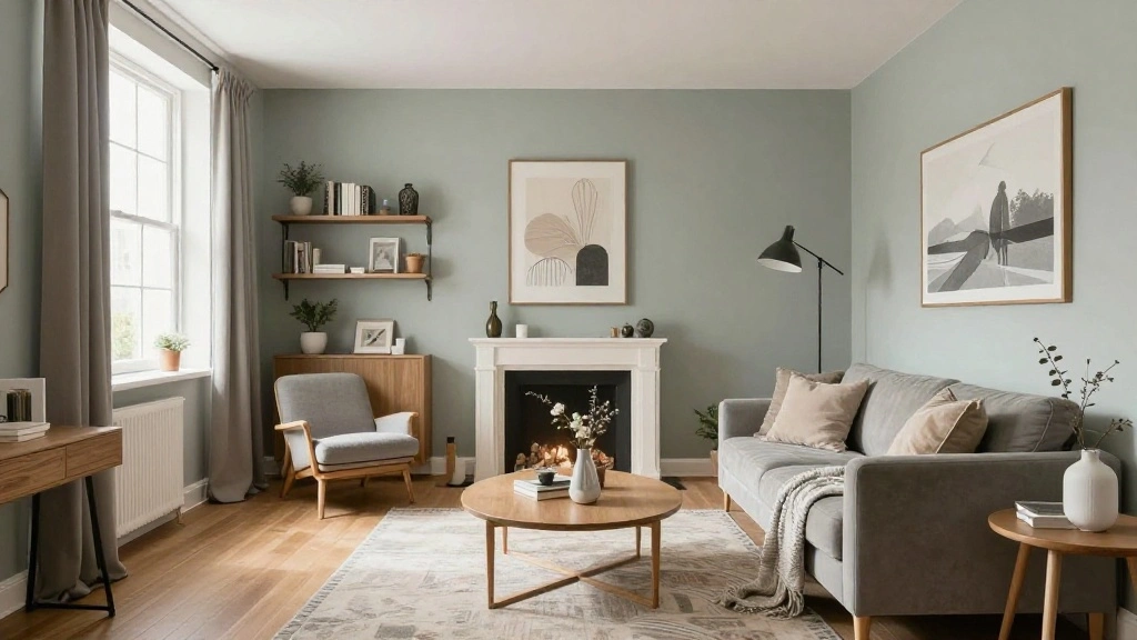
Are you feeling overwhelmed by the endless choices of colors when decorating your apartment? A poorly coordinated color scheme can make a space feel chaotic and unwelcoming. It’s crucial to establish a harmonious color palette that reflects your personal style and enhances your living environment.
In this guide, you will learn how to create a cohesive color palette that transforms your apartment into a stylish haven. By the end of this article, you’ll have a clear understanding of color theory, practical tips for selecting colors, and the tools to apply your palette effectively.
This guide is designed for beginners and will take approximately 2-3 hours to complete. You’ll explore essential concepts and actionable steps to ensure that your space feels unified and inviting.
Let’s get started on making your apartment a reflection of your unique taste!
TL;DR Summary
- Understand the basics of color theory and how it applies to your space.
- Gather inspiration and select a primary color for your palette.
- Choose secondary and accent colors that complement your primary choice.
- Apply your color palette effectively across your apartment for a harmonious look.
TL;DR Summary
Editor’s Choice

FAVOMOTO 1 Set Standard Paint Sample Cards, 365 Colors Walls Paint Chips…

Pantone FHI Color Guide Set | Fashion, Home & Interiors Fan Deck for Tex…

COHEALI Color Wheel 9.05In Rotatable Color Mixing Guide for Painting Dra…
Prerequisites/Materials Needed
- Color wheel or color palette app
- Paint samples or swatches (at least 5)
- Fabric samples (for textiles)
- Notebook for taking notes and sketching ideas
- Camera or smartphone (for capturing inspiration)
Prerequisites/Materials Needed
Editor’s Choice

Creative Color Wheel Enamel pin, The Spinning Wheel Moves Nicely,Color…


Sherwin Williams Colors collection Deck Complete Paint Colors
Skill Level & Time Estimate
Skill Level: beginner
Total Time Estimate: 2-3 hours
Breakdown:
- Understanding color theory: 30 minutes
- Gathering inspiration: 30 minutes
- Selecting colors: 1 hour
- Applying colors: 1 hour
Skill Level & Time Estimate
Editor’s Choice

Color Palette Book: 205 Color Schemes, Inspiration for Graphic Designers…
Sherwin Williams Colors collection Deck Complete Paint Colors

JimKing Creative Color Wheel, Paint Mixing Learning Guide, Art Class Tea…
Step 1: Understand Color Theory

Begin by familiarizing yourself with basic color theory. Understanding how colors interact can help you create a cohesive palette. Follow these steps:
- Learn about primary, secondary, and tertiary colors.
- Explore color schemes such as monochromatic, analogous, and complementary.
- Use a color wheel to visualize relationships between colors.
Pro Tip: Use online resources or color theory books for deeper insight. Warning: Avoid choosing colors just based on personal preference; consider how they work together. This foundational knowledge will guide your choices as you select colors.
Time estimate: 30 minutes
Step 1: Understand Color Theory
Editor’s Choice

A Dictionary Of Color Combinations Vol 1 (Japanese Edition)
Sherwin Williams Colors collection Deck Complete Paint Colors
Step 2: Gather Inspiration

Next, gather inspiration from various sources. This will help you identify styles and colors that resonate with you. Follow these steps:
- Browse design magazines or websites like Pinterest and Houzz.
- Create a mood board with images that inspire you.
- Capture photos of spaces you admire, focusing on their color schemes.
Pro Tip: Look for common themes or colors in your inspiration. Warning: Don’t overwhelm yourself with too many ideas; focus on a few that truly resonate. This step is vital for defining your aesthetic and narrowing down color choices.
Time estimate: 30 minutes
Step 2: Gather Inspiration
Editor’s Choice

200PCS Motivational Stickers, Inspirational Positive Affirmation Sticker…
Step 3: Choose a Primary Color

Once you’ve gathered inspiration, it’s time to select a primary color for your palette. This color will set the tone for the entire space. Follow these steps:
- Review your mood board and identify a primary color that stands out.
- Consider the emotions associated with this color and how it fits your lifestyle.
- Test paint samples on walls to see how the color looks in different lighting.
Pro Tip: Choose a color that feels comfortable and inviting. Warning: Avoid overly bold colors unless you plan to use them sparingly as accents. Having a strong primary color provides a stable foundation for your palette.
Time estimate: 30 minutes
Step 3: Choose a Primary Color
Editor’s Choice
JimKing Creative Color Wheel, Paint Mixing Learning Guide, Art Class Tea…

Joyeee Lip Gloss Palette, 18 Colors Dard Red Pink Nude Brown Lip Makeup …

All-In-One Vision Board Kit for Women: 150 Aesthetic Picture & Quote/Aff…
Step 4: Select Secondary Colors

After choosing a primary color, it’s essential to select secondary colors that complement it. These colors will create depth and interest in your space. Follow these steps:
- Choose 1-2 secondary colors that harmonize with your primary color.
- Use the color wheel to find complementary options.
- Test fabric samples or décor items in these colors to ensure they match your vision.
Pro Tip: Consider lighter and darker shades of your primary color for a cohesive look. Warning: Avoid selecting too many bold secondary colors; keep it simple for a cohesive feel. Secondary colors enhance your primary choice and can highlight various elements in your room.
Time estimate: 30 minutes
Step 4: Select Secondary Colors
Editor’s Choice

JimKing Creative Color Wheel, Paint Mixing Learning Guide, Art Class Tea…

Magicfly 15 Pcs Chalk Furniture Paint Set, 9 Colors Ultra Matte Finish A…
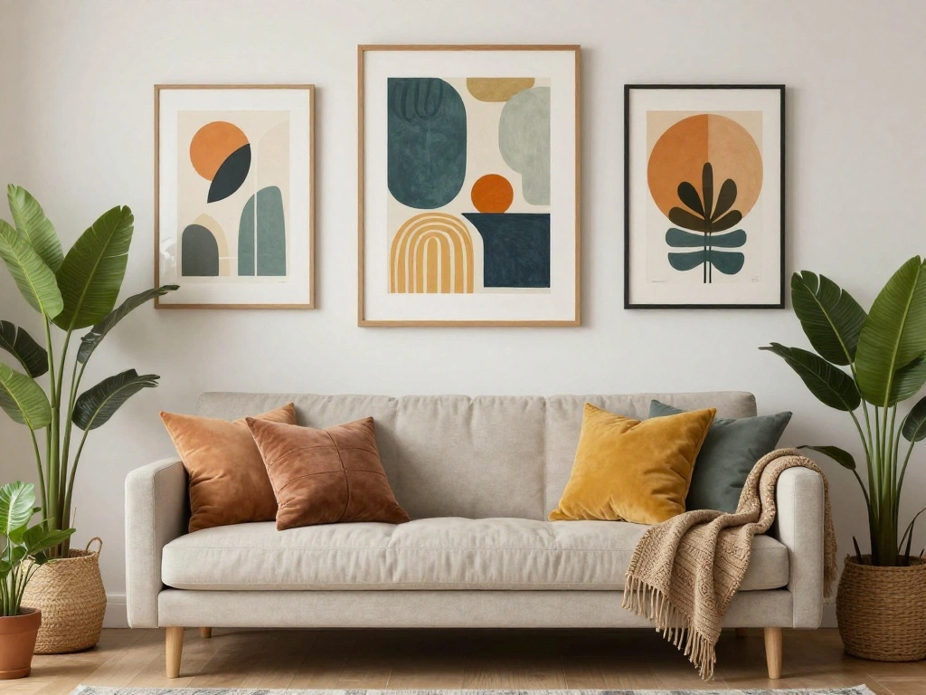
Step 5: Choose Accent Colors
Accent colors will add flair and personality to your apartment. These colors should contrast with your primary and secondary colors to create visual interest. Follow these steps:
- Select 1-3 accent colors that pop against your primary and secondary shades.
- Use bright or dark tones to create contrast.
- Ensure these colors are represented in smaller décor items.
Pro Tip: Use accessories like cushions, art, or vases to introduce accent colors. Warning: Avoid overusing accent colors; they should complement, not overwhelm. Accent colors can energize your space and make it feel dynamic and engaging.
Time estimate: 30 minutes
Step 5: Choose Accent Colors
Editor’s Choice

3D Floral Green Wall Art (Set of 2) Lightweight, Wooden Ready-to-Hang Bo…

EDOW Throw Pillow Inserts, Set of 4 Lightweight Down Alternative Polyest…
Step 6: Test Your Palette

Before finalizing your color palette, it’s essential to test how the colors work together in your apartment. Follow these steps:
- Visualize your color selections in different rooms.
- Create digital mockups using design software or apps.
- Consider how natural light affects color perception throughout the day.
Pro Tip: Take photos of your selections in each room to compare. Warning: Don’t rush this step; take the time to ensure your colors mesh well. Testing your palette helps you avoid costly mistakes and ensures a harmonious outcome.
Time estimate: 30 minutes
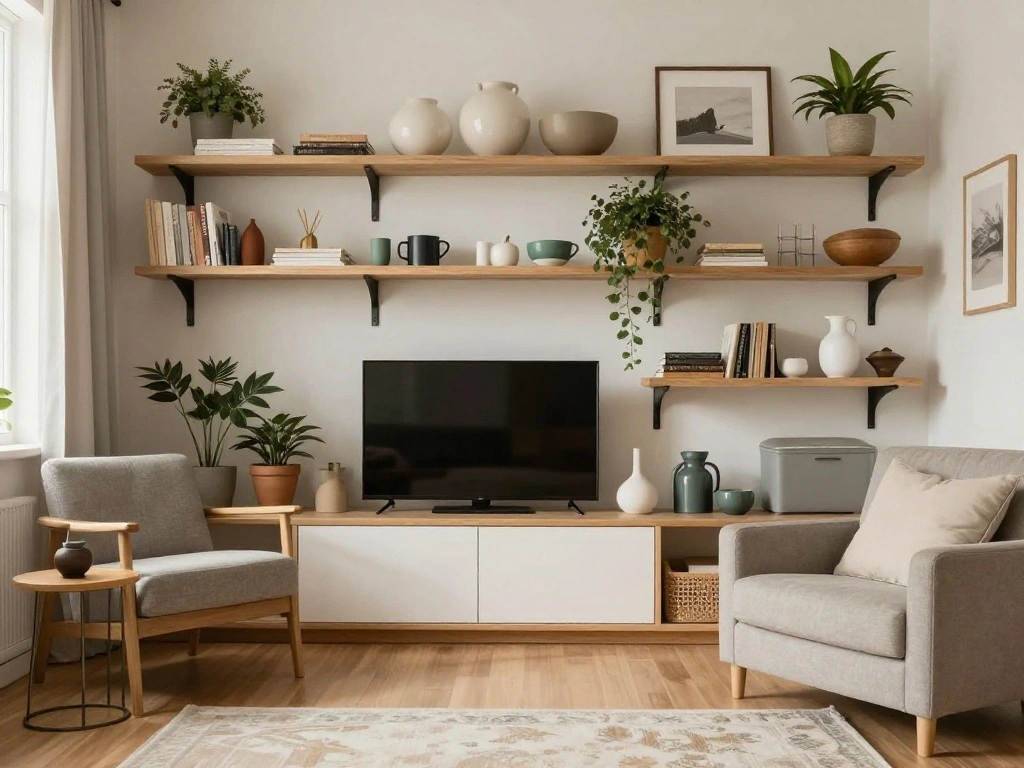
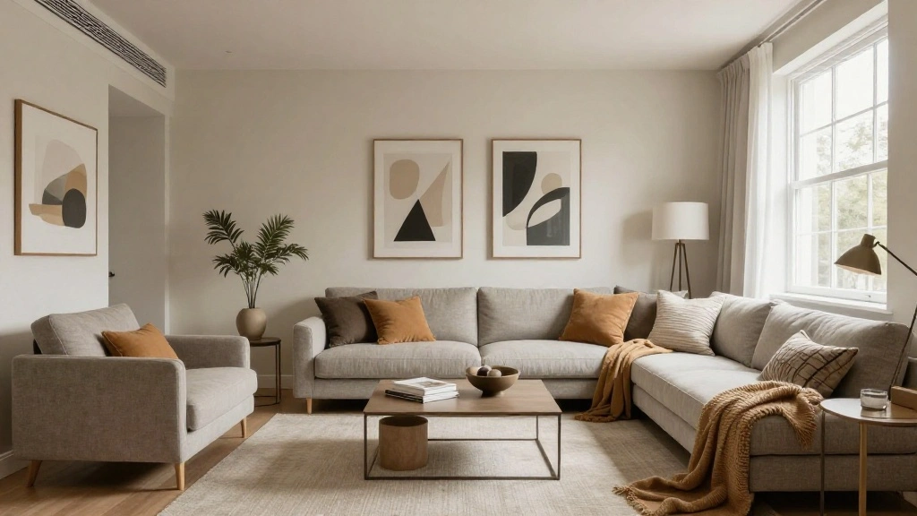
Step 7: Apply Your Color Palette

Now that you’ve finalized your color palette, it’s time to apply it throughout your apartment. Follow these steps:
- Start with the largest surfaces, such as walls and larger furniture pieces.
- Incorporate secondary colors in textiles like curtains, rugs, and pillows.
- Use accent colors in smaller décor items and accessories.
Pro Tip: Keep a cohesive theme by repeating colors in different areas of the apartment. Warning: Avoid sudden color jumps between rooms; flow is key. Applying your palette effectively creates a unified look and feel throughout your space.
Time estimate: 1 hour
Step 7: Apply Your Color Palette
Editor’s Choice
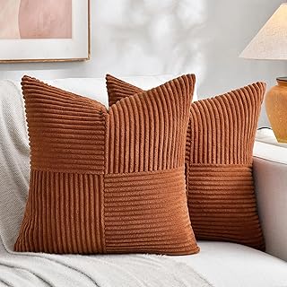
Fancy Homi 2 Packs Rust Boho Decorative Throw Pillow Covers 18×18 Inch f…


Fabric Swatch Book: Simple Organiser for Artists and Designers to Catalo…
Step 8: Accessorize Thoughtfully
Once your palette is applied, accessorizing thoughtfully can elevate your space. Follow these steps:
- Select artwork and décor that incorporates your chosen colors.
- Use plants to add freshness and contrast to your color scheme.
- Consider lighting as an accessory; it can enhance or alter how colors look.
Pro Tip: Rotate accessories seasonally to keep the space feeling fresh. Warning: Avoid clutter; too many accessories can dilute your color scheme. Thoughtful accessorizing ties the space together and enhances the overall aesthetic.
Time estimate: 30 minutes
Step 8: Accessorize Thoughtfully
Editor’s Choice

Whonline Fake Hanging Plants, Artificial Small Potted Plants for Indoor …
Step 9: Evaluate and Adjust

After implementing your color palette, take some time to evaluate how it feels. Follow these steps:
- Live in the space for a few days to see how the colors interact.
- Make notes on any colors that feel off or overpowering.
- Adjust elements as needed, such as swapping out accessories or adding more textures.
Pro Tip: Ask friends for feedback to gain a fresh perspective. Warning: Don’t hesitate to change things up if something doesn’t feel right! Evaluating your space allows you to refine your choices and ensure a harmonious result.
Time estimate: 30 minutes
Step 9: Evaluate and Adjust
Editor’s Choice

Utopia Bedding 18×18 Pillow Inserts, Set of 2, White – Indoor Decorati…

The Color Wheel Company Interior Design Wheel interior design color whee…

Rust-Oleum 1993730 Painter’s Touch Latex Paint, Half Pint, Semi-Gloss Wh…
Step 10: Maintain Your Color Palette
Finally, maintaining your color palette is essential for keeping your apartment looking cohesive. Follow these steps:
- Regularly clean and refresh décor items to keep colors vibrant.
- Consider seasonal updates, like changing throw pillows or artwork.
- Stay consistent with new purchases to ensure they match your color scheme.
Pro Tip: Create a color reference guide for new items you purchase. Warning: Avoid introducing too many new colors that clash with your palette. Maintaining your color palette ensures your apartment remains a reflection of your style over time.
Time estimate: Ongoing
Step 10: Maintain Your Color Palette
Editor’s Choice

Colorful Abstract Wall Art Multi Color Graffiti Canvas Pictures Bedroom …

Utopia Bedding Throw Pillows (Set of 4, White) – 18 x 18 Inches Down A…
Pro Tips
- Color Sample Testing: Always test paint samples on your wall; colors can look drastically different in different lighting.
- Use Neutrals Wisely: Neutral colors can help balance bold colors and provide breathing room in your palette.
- Consistency is Key: Ensure that your primary, secondary, and accent colors flow well together to avoid visual clutter.
- Texture Matters: Incorporate different textures in your decor to add depth to your color palette.
- Seasonal Changes: Don’t be afraid to adjust your color palette with the seasons for a fresh look.
Pro Tips
Editor’s Choice

Color Analysis Draping Kit – Find Your Season at Home | DIY Color Anal…

Zinsser 02774 PERMA-WHITE Mold & Mildew Proof Interior Paint, Quart, Egg…
JimKing Creative Color Wheel, Paint Mixing Learning Guide, Art Class Tea…
Common Mistakes to Avoid
Warning: Choosing too many bold colors can create chaos. Stick to a few strong colors to maintain balance. Warning: Ignoring lighting conditions can lead to poor color choices. Always observe colors at different times of day. Warning: Overcrowding with accessories can dilute your palette. Keep it simple and focused. Warning: Forgetting about flow between rooms can disrupt the feel of your apartment. Ensure colors transition smoothly. Warning: Not considering personal feelings towards colors can lead to dissatisfaction. Choose colors that resonate with you emotionally.
Common Mistakes to Avoid
Editor’s Choice
JimKing Creative Color Wheel, Paint Mixing Learning Guide, Art Class Tea…

Feit Electric A19 Smart LED Light Bulb, 60W Equivalent, Dimmable, RGBW C…
Troubleshooting Section
Problem: Colors look different in the store than at home.
Solution: Always test samples in your space before making final decisions.
Problem: The room feels smaller than expected.
Solution: Choose lighter colors and incorporate mirrors to create the illusion of space.
Problem: Some colors clash when placed together.
Solution: Refer back to your color wheel to find complementary matches.
Problem: The space feels too bright or overwhelming.
Solution: Introduce neutral colors to tone down intensity.
Problem: Difficulties in mixing patterns.
Solution: Stick to a limited color palette across patterns to maintain cohesiveness.
Troubleshooting Section
Editor’s Choice
FAVOMOTO 1 Set Standard Paint Sample Cards, 365 Colors Walls Paint Chips…

DUMOS 64″x21″ Arched Full Length Floor Mirror, Full Body Mirror with Sta…
JimKing Creative Color Wheel, Paint Mixing Learning Guide, Art Class Tea…
Variations/Alternative Methods
- Using a monochromatic scheme: Focus on varying shades of a single color for a subtle look.
- Going bold with contrasting colors: Use two opposite colors on the color wheel for a vibrant effect.
- Incorporating natural elements: Utilize colors found in nature for a calming, organic feel.
Variations/Alternative Methods
Editor’s Choice
Sherwin Williams Colors collection Deck Complete Paint Colors
JimKing Creative Color Wheel, Paint Mixing Learning Guide, Art Class Tea…

A Dictionary Of Color Combinations Vol 1 (Japanese Edition)
FAQs
- What if I don’t have a specific color in mind? Start with colors in your favorite artwork or textiles for inspiration.
- How long should I wait before making adjustments? Live with your color choices for at least a week to see how you feel.
- Is it safe to mix patterns with my color palette? Yes, but ensure they share at least one common color for cohesion.
- What if my colors clash under different lighting? Always test your colors in your specific lighting conditions before committing.
- Can I change my palette seasonally? Absolutely! Seasonal changes can refresh your space without a complete overhaul.
FAQs
Editor’s Choice

Mighty Board Minis Polystyrene Paint Color Test Panels, 12″ x 9″, Set of…
JimKing Creative Color Wheel, Paint Mixing Learning Guide, Art Class Tea…

Patterns of Portugal: A Journey Through Colors, History, Tiles, and Arch…
Conclusion
Congratulations! You’ve successfully built a cohesive color palette for your apartment. By following these steps, you’ve transformed your space into a harmonious reflection of your style.
Now that you’ve completed this guide, consider exploring additional resources on interior design or color theory to further enhance your skills. Remember, your home is a canvas, and your color choices are the brushstrokes that bring it to life!